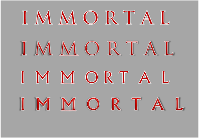
Font Testing:
After looking at various fonts from magazine from the rock/indie genre, I have decided that I like serif fonts, and it should have some sort of border. I want the letters to have spaces in between so it takes up the whole of the top of the magazine. These are the fonts I have tested out to be my title. Out of these I like Trajan Pro and and Narkisim. I feel like both of these fonts look like magazine titles, and they're spaced out enough to not look to busy.
These are tests of the fonts Trajan Pro and Narkisim. I prefer the second and fourth versions of these fonts, as the shadowing makes it look more in depth and professional.


No comments:
Post a Comment