Wednesday, 29 January 2025
Friday, 29 April 2016
Thursday, 28 April 2016
Wednesday, 27 April 2016
Tuesday, 26 April 2016
Monday, 25 April 2016
Monday, 21 March 2016
14- Planning: Tutorials
This is a list of the tutorials I have used throughout my project.
This is a tutorial I used to help me remove the background of various photos in photoshop.
13- Final Magazine
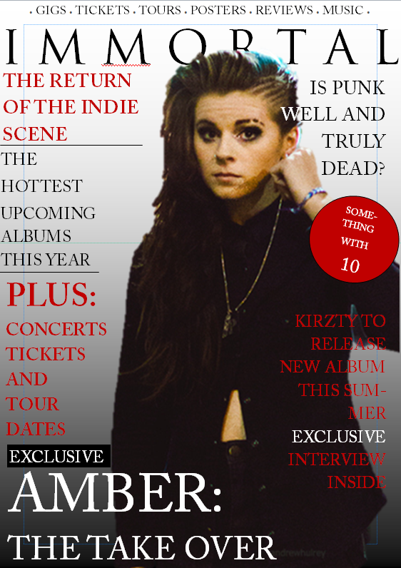
Final Magazine

This is my final magazine cover that I have created from my mock up along with comments from my focus group. One of the more noticable things I have changed is the title- I decided I didn't want my title to have too many letters in, as having the word "Immortal" meant the letters had to be much smaller than I'd like. With the word "Decode" however, I could put space between the letters and make the font bigger. I decided to neaten up the plugs by keeping to one colour (This colour forms the house style) I tried to keep it black white and red as this is the colour scheme I have throughout.

For the contents page, I wanted to continue to fit in with the house style of the magazine, by keeping the same font and colour. I wanted to make it as visual as possible, by adding lots of photos and not leaving any gaps or blank spaces. I added the word "Decode" to the contents page as I thought this was a good way to fit in with the house style. I added a poster feature, because I noticed that in my research the majority of magazines had this.

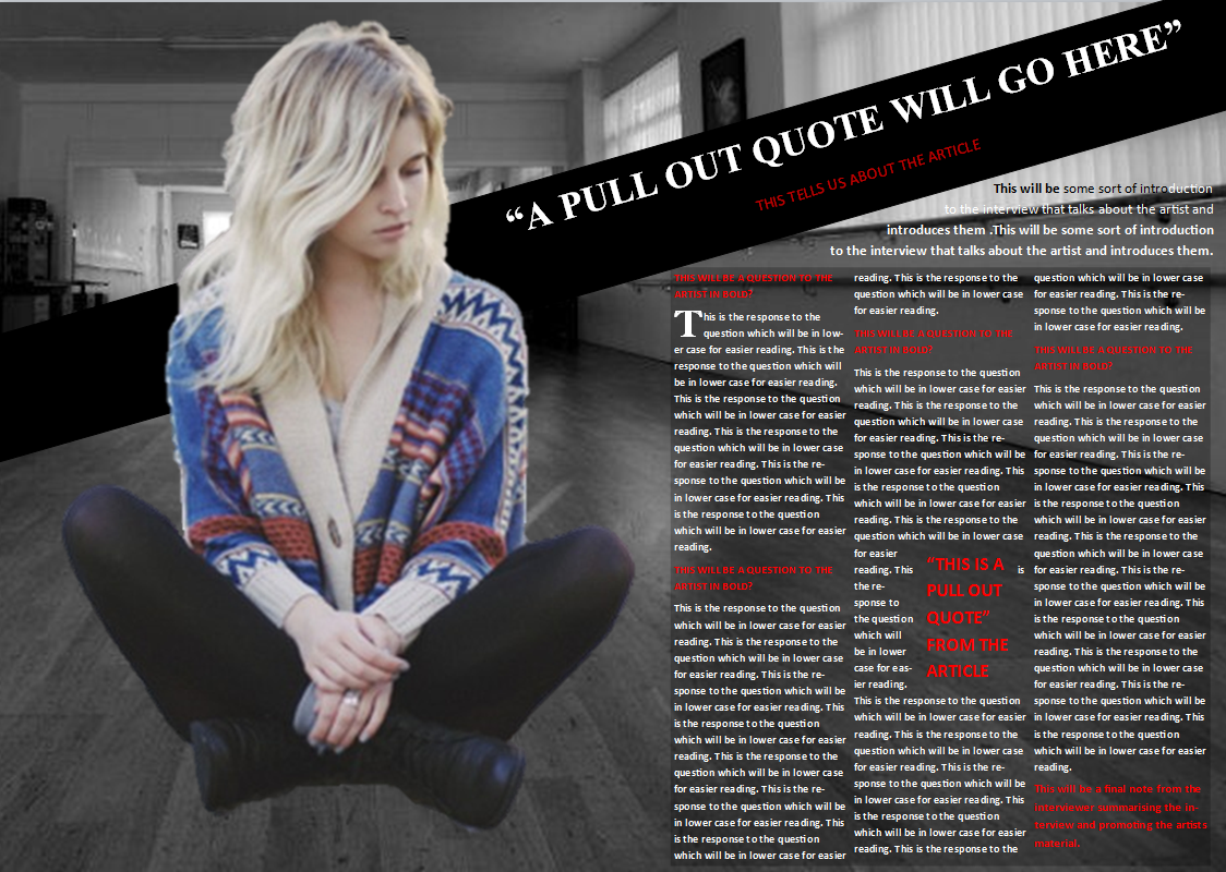
This is the double page spread for my magazine. I again kept with the house style by keeping it red, black and white. I also used the same font for the title and the article. I wanted to try and create a light look for the article, by using a bright background to contrast the black bar across the top. The outfit that my model reflects this, as she is wearing light jeans contrasted with black shoes, and then the red jumper. The lack of direct mode of address works well here as it shows her as looking up, as in she is looking up about how she "stepped up". I wanted to illustrate her power in the photo subtly, and i did this by having her look away and look more serious.
Thursday, 28 January 2016
12- Planning: Mock Up
This is my mock up for my final magazine. This is what I used to create the real thing.
One of the main things I am going to change when I do my real front cover is the title. Although my focus group preferred the name Immortal, Decode will fit better across the top, and the lesser amount of letters will help it stand out more.
Because of feedback from my focus group, I decided to have one font rather than multiple throughout the front cover. This was to ensure consistency and to help keep it the same.
I wanted the most bold thing (besides the title) to be the artists name on the front, hence it being at the bottom. It is also in the opposite colour to the backgroup to make it stand out even more.
For my mockup, I decided to follow the codes and conventions of a music magazine by having the photo of the girl take up one whole page. I decided to have a bar across the magazine for the title as this made the image stand out more, and makes it look 3D.
I used red text for the questions as I wanted it to stand out more, to catch the audiences eye. However in the real thing I may change the colour because the brightness of this one is a bit hard on the eye. So I might go for a shade of blue that is still bright but not too harsh.
I want to also make the pull out quote in capital letters to make it more eye catching.
I like the fact that the background is black and white as it makes the girl stand out. I want to recreate this in the real thing.
I'm going to include a pull out quote in the main text as it is eye catching and will give more detail about the article before they actually read it. I want to make it 'sink in' to the text more because at the moment it seems too blocky.

For my contents page, I wanted to include a lot of photos to make it stand out as much as possible. I also wanted a lot of writing on my page to include as many articles as possible.
There is a lot I want to improve on this page for the real thing. Firstly, I need to include the date somewhere, to indicate when the magazine is published. I also would like to close the gap between the group photo and the alone male photo at the bottom of the page, by making the group photo larger. The three girls that are next to the group photo need to have imahes the same size to make it look equal and neater. Down the right side, the column that has the numbers on arent positioned well, and I want to create a "Drop Cap" effect on the page numbers for the article. I'd also like to make the "Posters" section look tidier.
Lastly, I'm going to change the colour of the bar on the right side to match the house style, so a darker red will be used.
Subscribe to:
Comments (Atom)