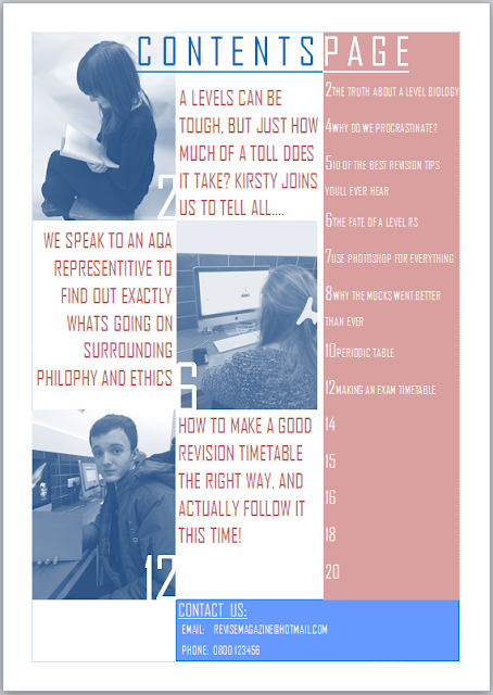
For the preliminary task, we had to create a school magazines front cover and contents page.
The first thing I decided to do for my front cover was choose a photo of someone that was reading, as this looks like they are working hard and reflects what the magazine is about, The open book also shows a positive attitude to learning which is what the magazine is trying to convey. They are in school uniform which emphasizes the school aspect of the magazine, and the girl is the target audience i want to achieve (16/17 year old girls in the 6th form.)
The front cover photo lacks direct address with eye contact, which should be essential on a front cover, to create a relationship with the audience. This would also incorporate the idea of the male gaze, as the woman on the front making eye contact with a male reading will draw him in more. I will make sure i have this on my real magazine to ensure it looks better.
My contents page looks messy with the two different colours contrasted, and there isnt much information on each story. Im going to use the same shade of one colour, and perhaps not tint the pictures to make it more colourful. I like the title of the contents page and the way it changed colour to the background, so I want to do the same in the real thing. I also like the way the contents is listed, so i will also include that in the real thing. I want to add more photos in the real one to make it more colourful. There also needs to be much more information on my real contents page.


No comments:
Post a Comment